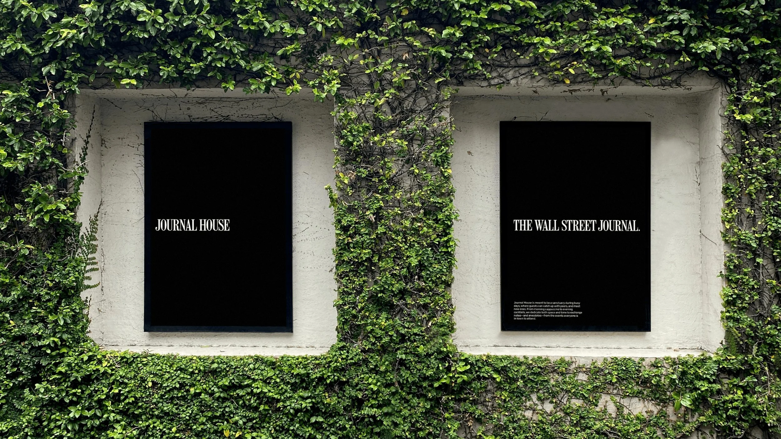
Journal House
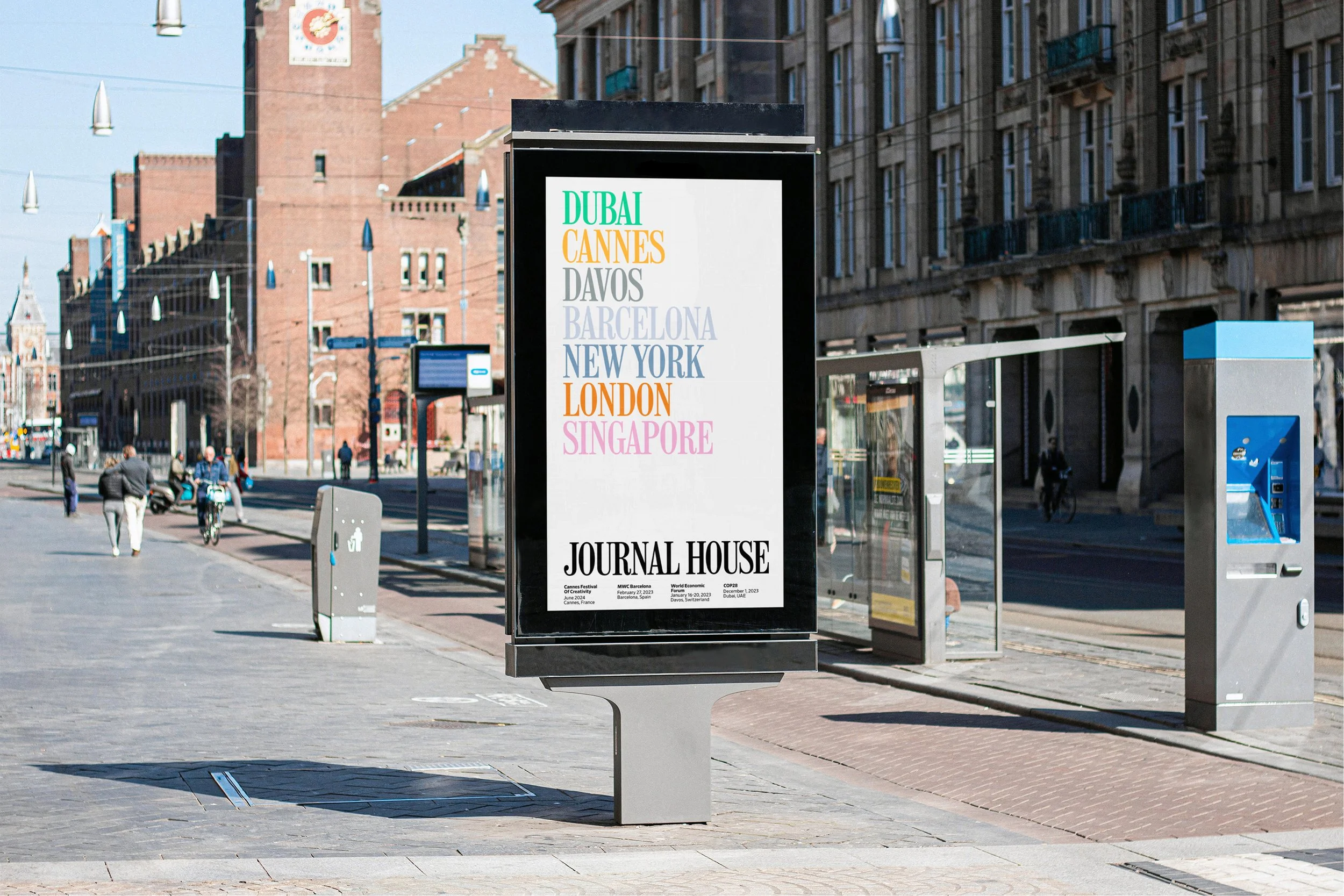
— Global Pop-Ups
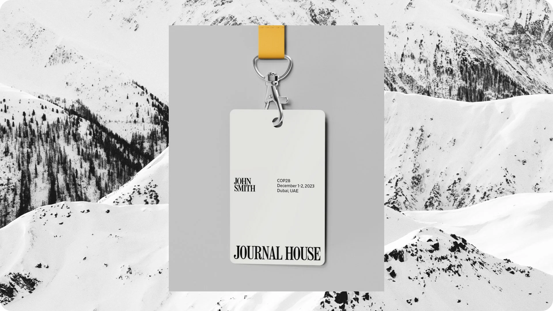
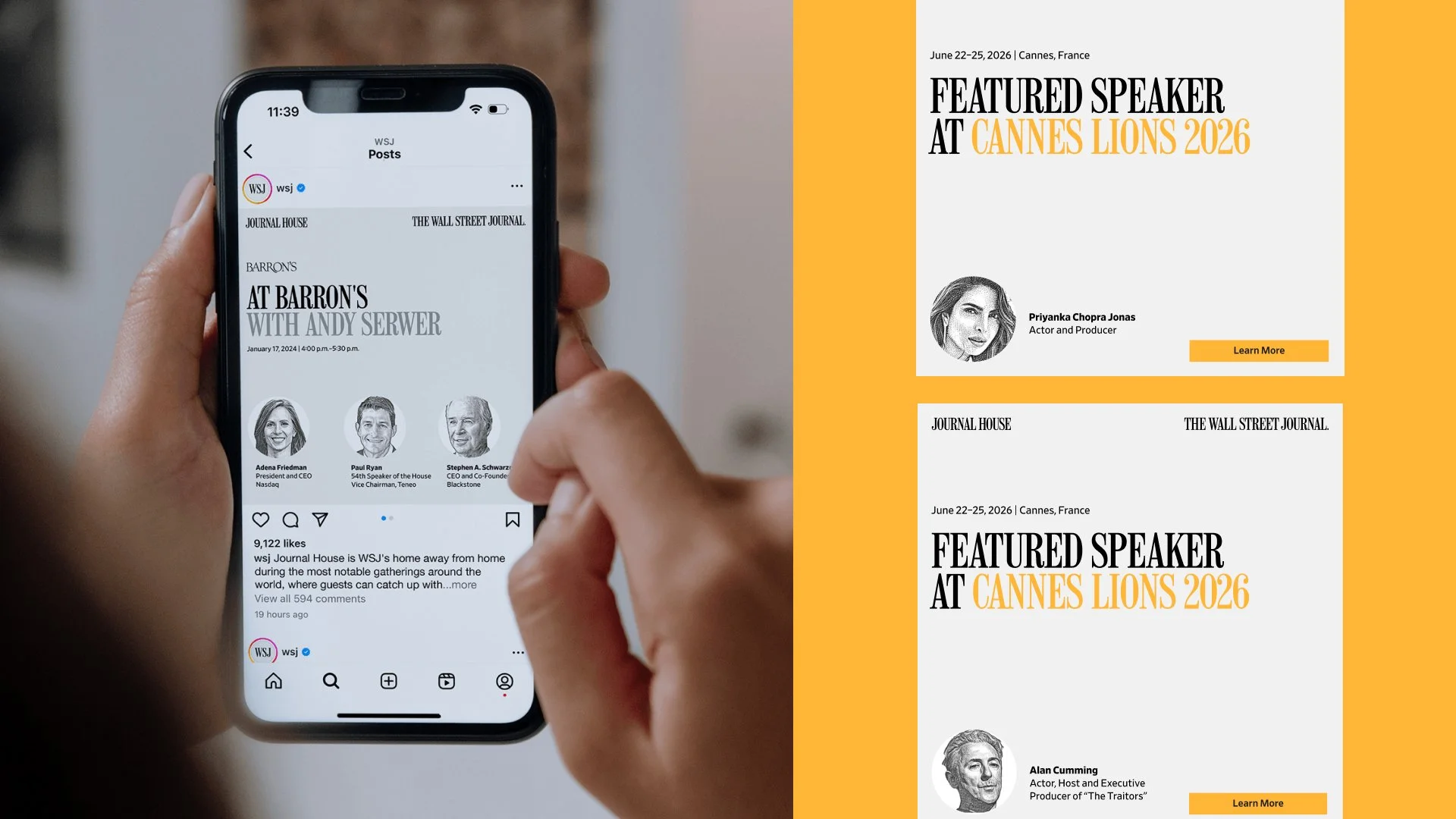
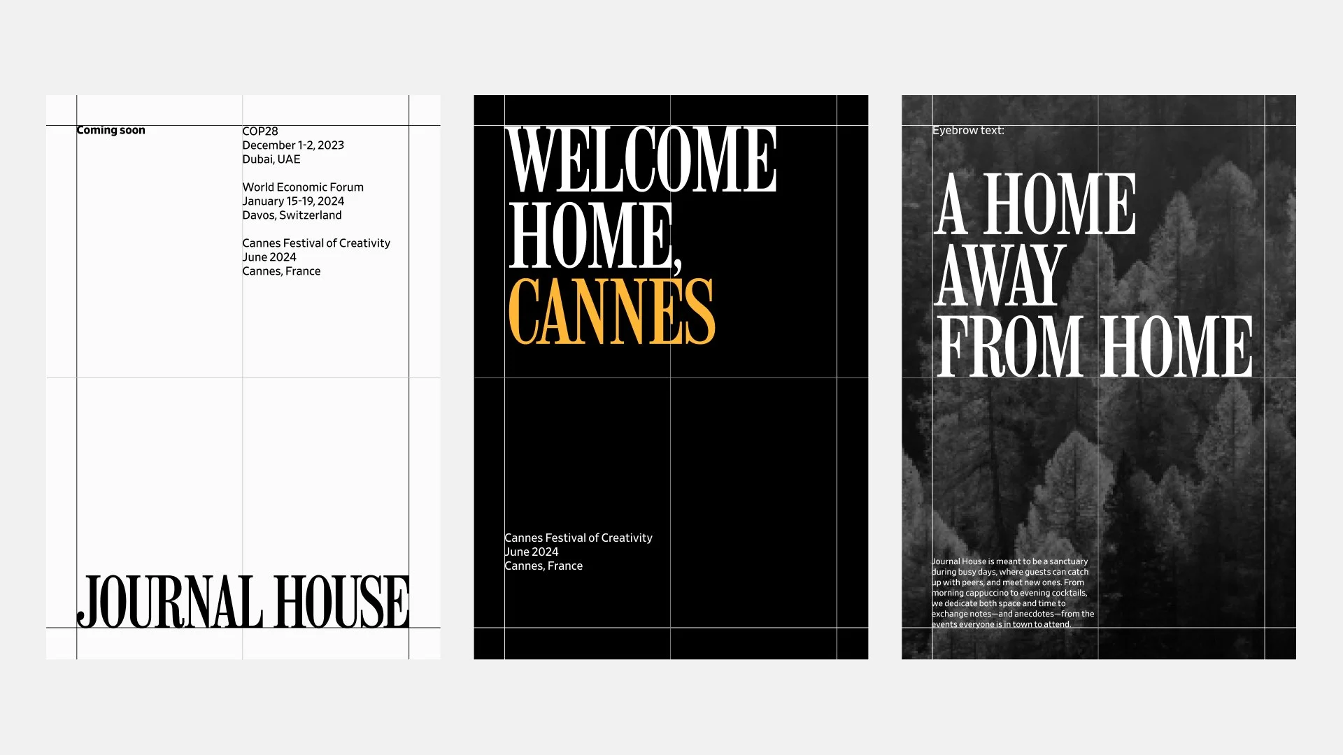
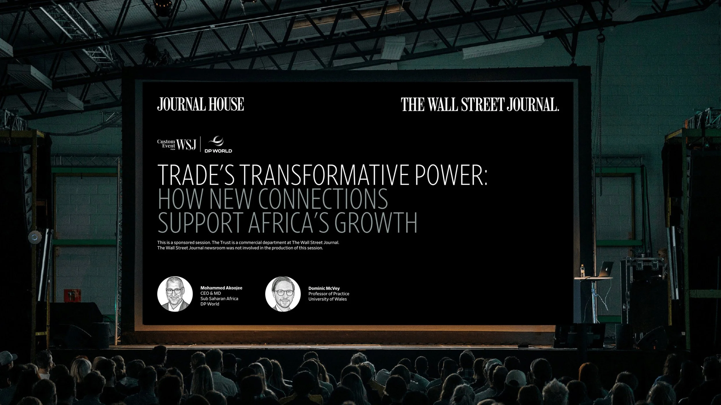
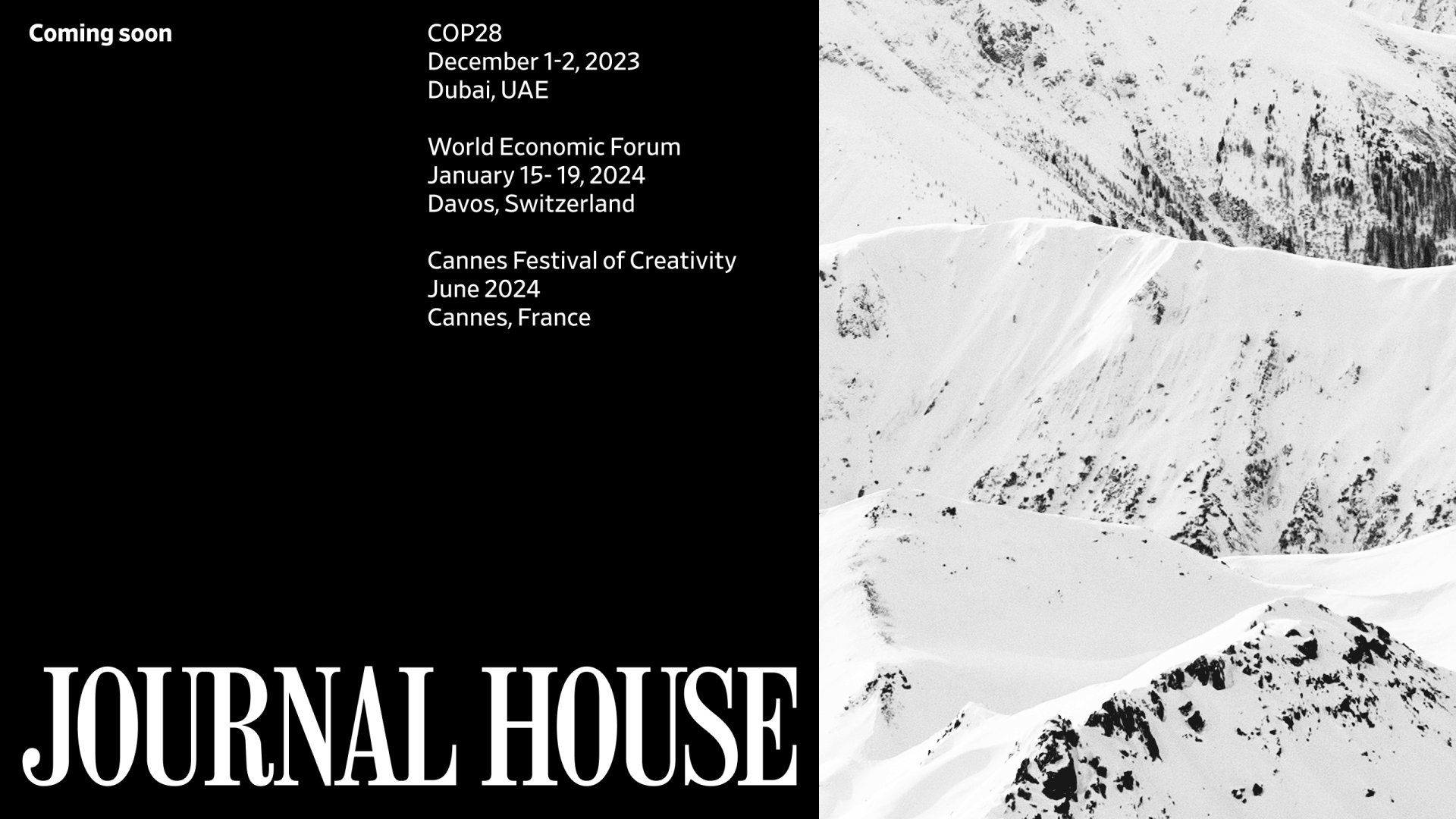
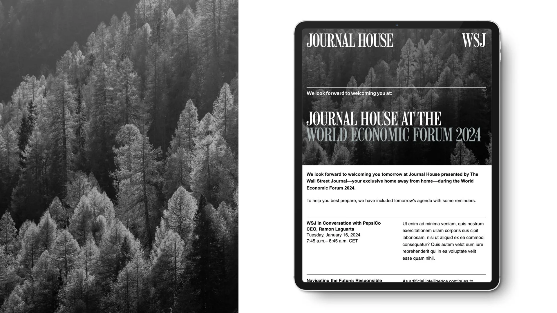
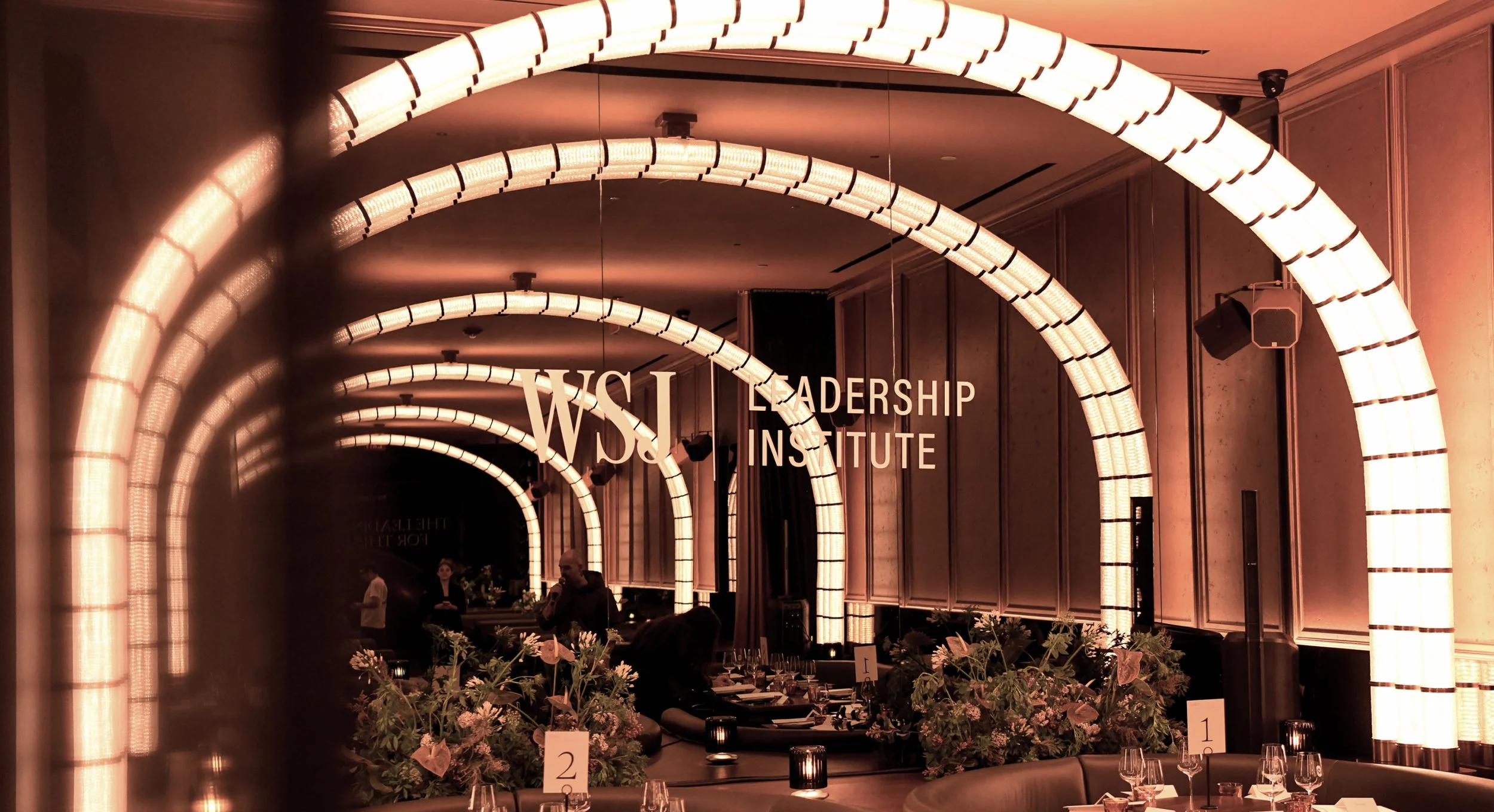
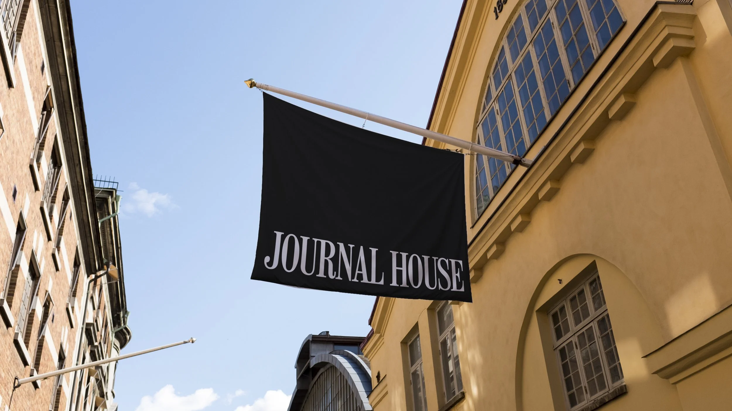
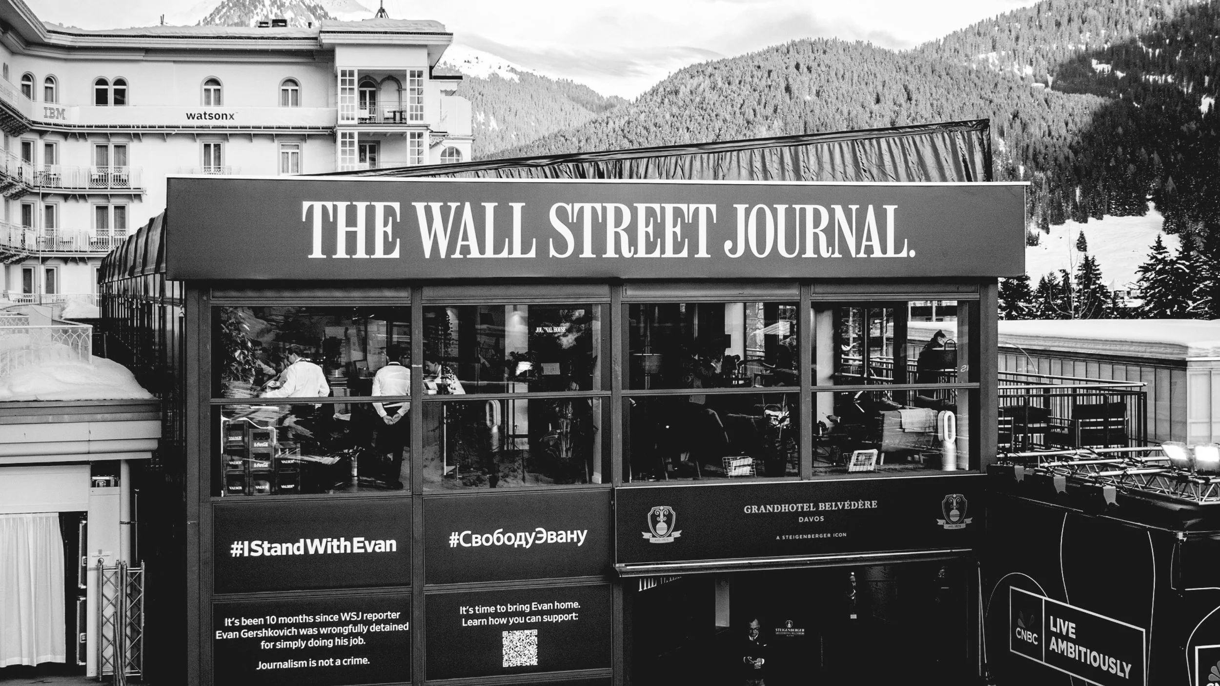
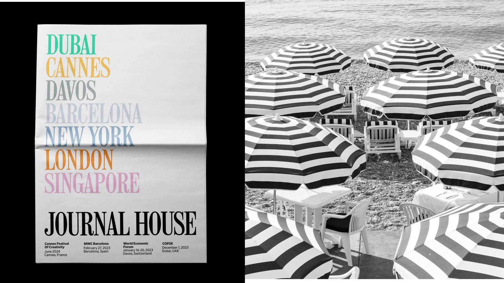
Global gatherings are chaotic, overscheduled, and unrelenting. Journal House is the antidote — a WSJ pop-up that appears at Cannes, Davos, UNGA, and beyond, offering something rare inside its walls: a place to slow down, have a real conversation, and learn about the world today through moderated live-journalism conversations.
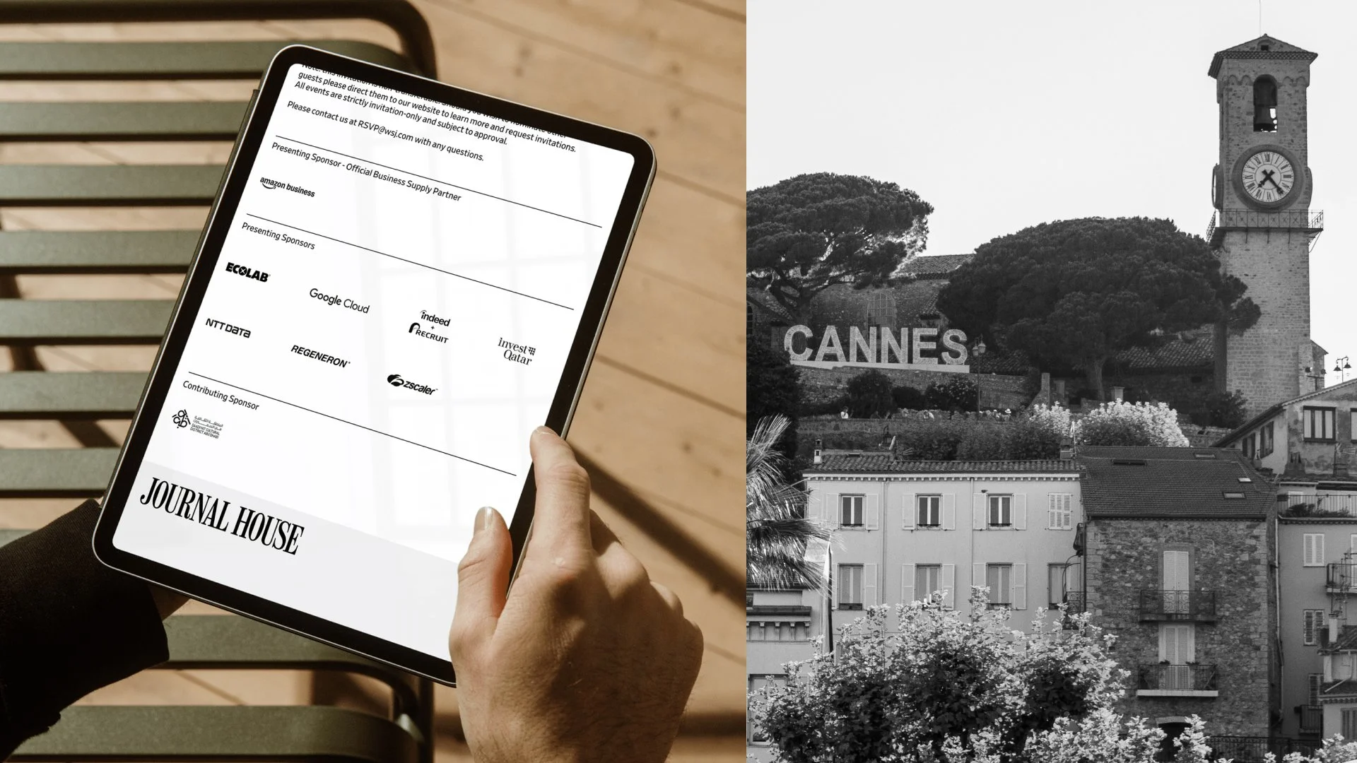
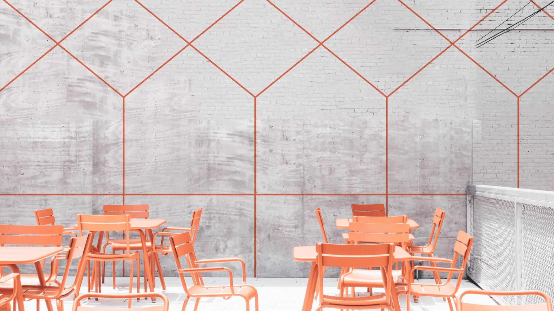
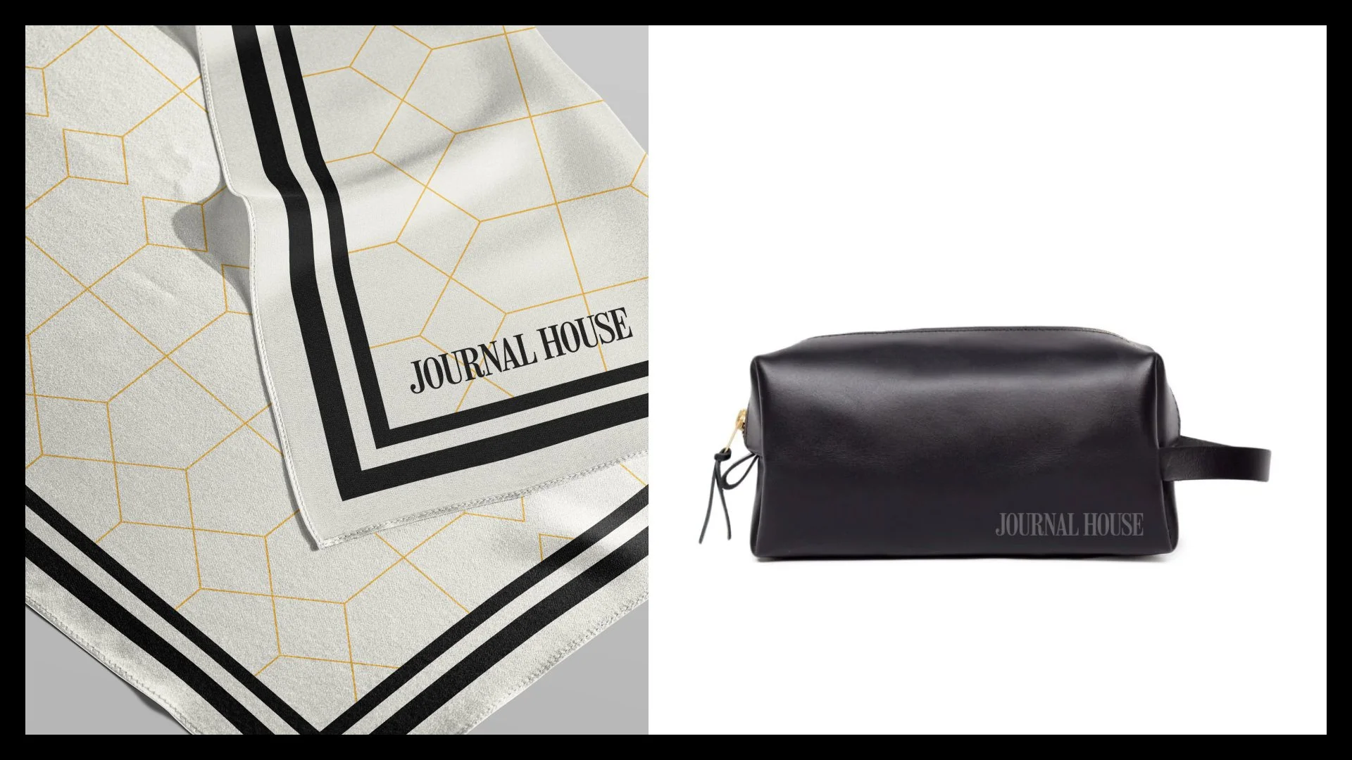
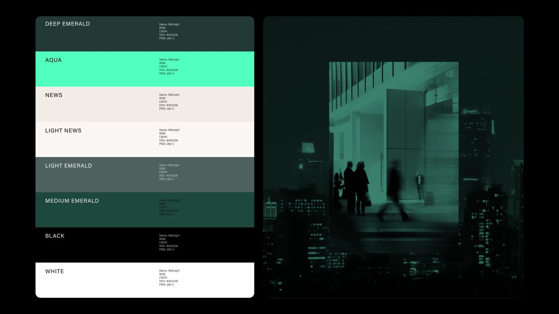
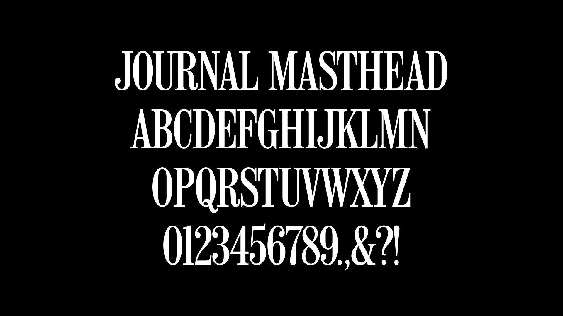
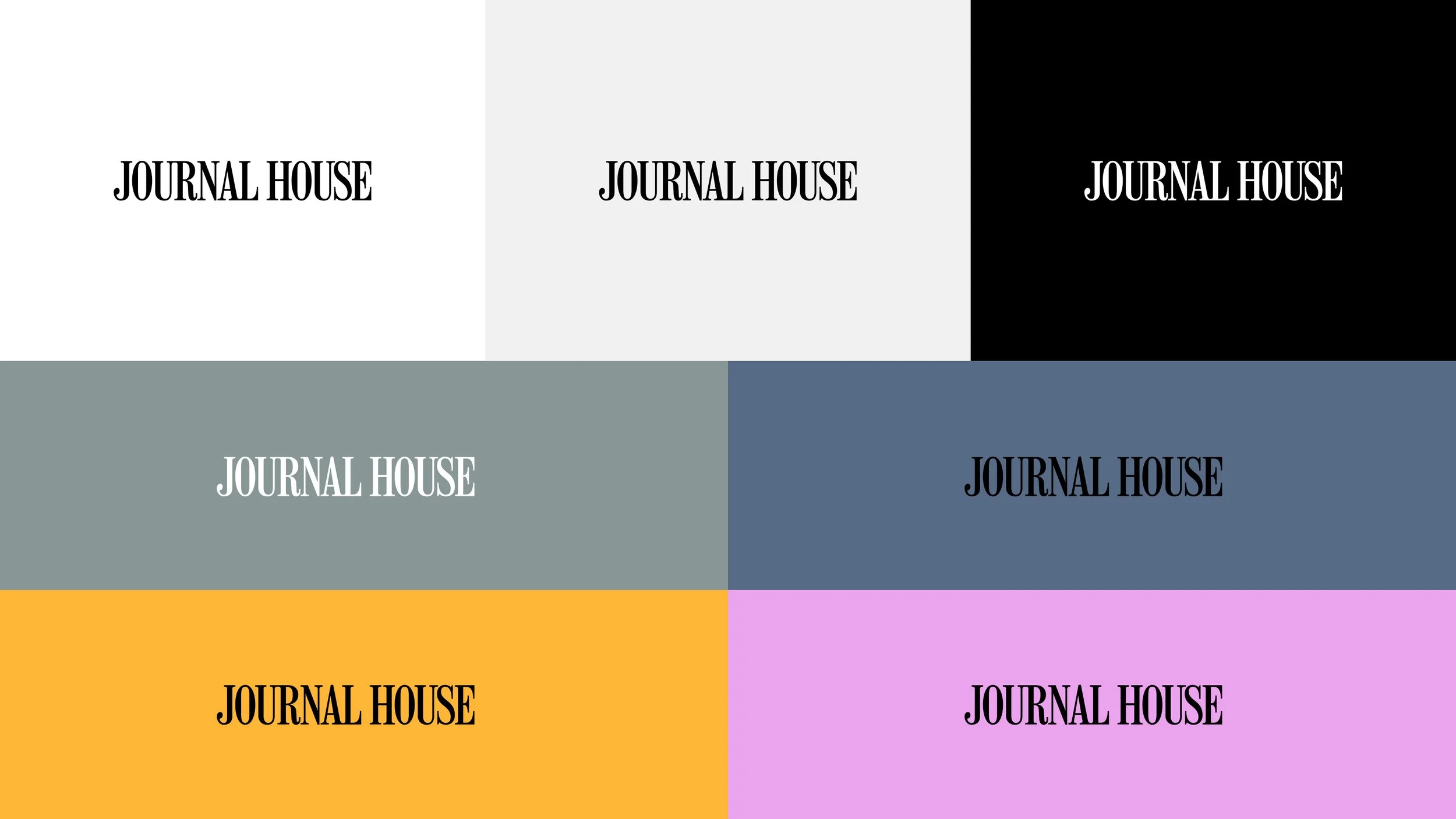
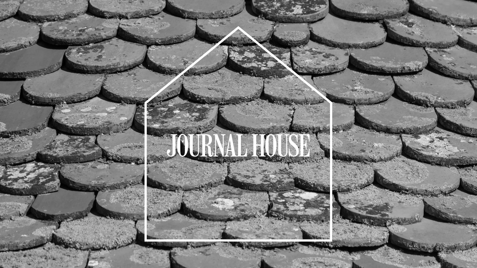
Journal House already had what most brands spend years trying to build — the convening power and editorial credibility of The Wall Street Journal. The new visual identity was designed to align expectation to reality. Black and white photography connects directly to WSJ's visual heritage; Journal Masthead, a custom typeface drawn from the letterforms of The Wall Street Journal's own masthead makes it ownable. Each Journal House is designed in response to its environment, with localized details, weather appropriate cocktails, swag worth keeping. A trusted brand meets its most luxurious expression.
Made in partnership
with Order — visual identity
with MCKL — customer typeface
with Huncwot — website
Dow Jones Brand Studio
VISUAL IDENTITY
WEBSITE
DESIGN LANGAUGE


APPLICATION